The Cobalt UI
Cobalt provides a graphical interface that lets you explore your data and the
discovered failure groups visually. A UI representing a Workspace can
be opened by running Workspace.ui in a cell. This will open the UI
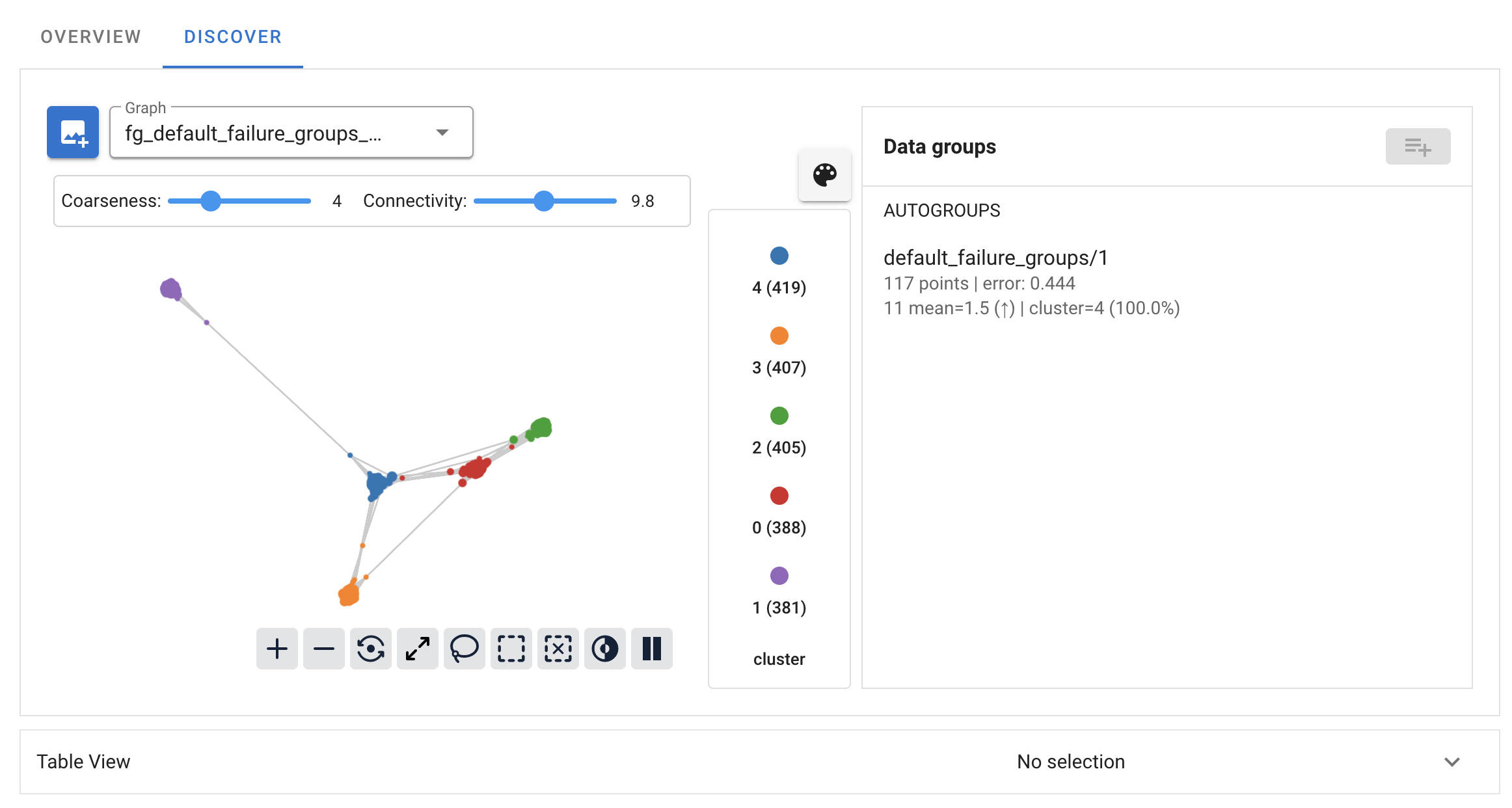
in the cell output. The UI looks like this:
In Jupyter Lab, right-clicking in the output cell and choosing “Create New View for Output” in the context menu will create a new Jupyter Lab tab with only the Cobalt UI that can be moved as desired. This can be helpful to separate the UI from the notebook.
See here for a video walkthrough of the UI, or read on for an explanation of individual components.
Landscape
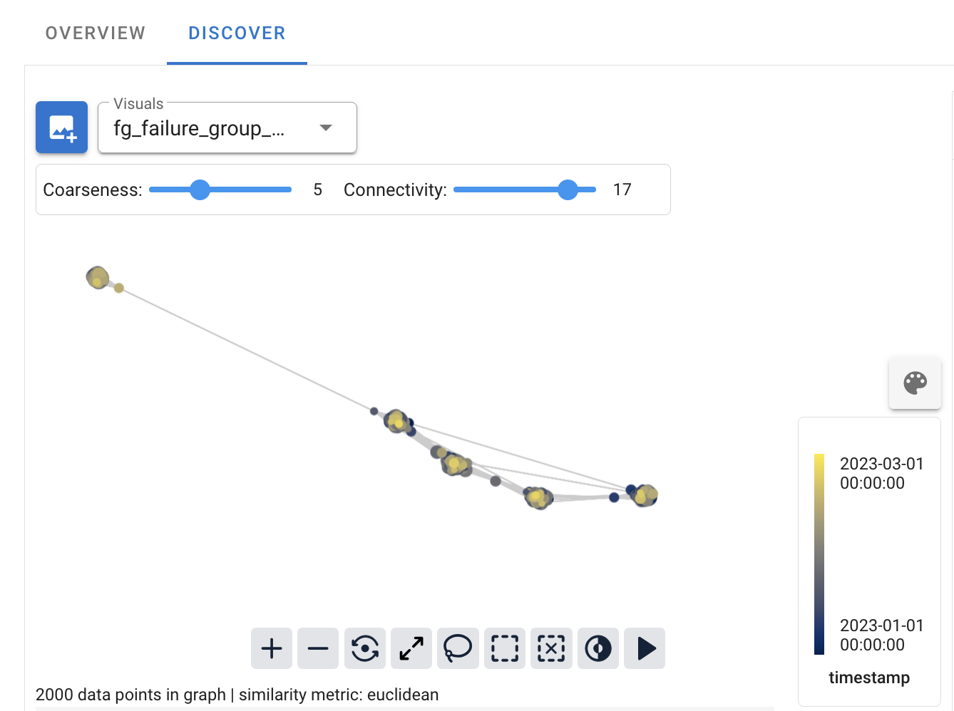
The Landscape is a graphical representation of (a subset of) the
CobaltDataset. Each node in the graph represents a group of data points,
and edges are formed based on the similarity of those groups. This graph is
multiscale: dragging the Coarseness slider will adjust the number of
nodes in the graph (and hence the sizes of the groups of data points).
Adjusting the Connectivity slider will control the number of edges in
the graph, where edges are added roughly in order of the similarity of the
groups they join. The landscape is constructed using the provided embeddings of
the data points, not the raw columns.
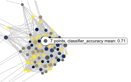
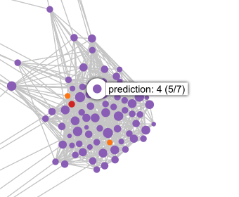
If a model performance metric is available, the colors of the nodes of the landscape will correspond to that performance metric. Otherwise, if model predictions have been provided, the colors of the nodes of the landscape will, by default, correspond to those predictions.
Nodes in the landscape can be selected by double-clicking, or by using the lasso or box selection tools. Nodes may be added to the current selection by holding the Shift key while using the lasso or box tools. Holding the Alt or Option key will activate the lasso selection tool for as long as the key is held.
When nodes in the graph are selected, the corresponding data points will be displayed in the data table, and may be saved as a group.
There may be more than one graph stored in the Workspace. If others have
been created, the active graph can be changed by selecting a new one from the
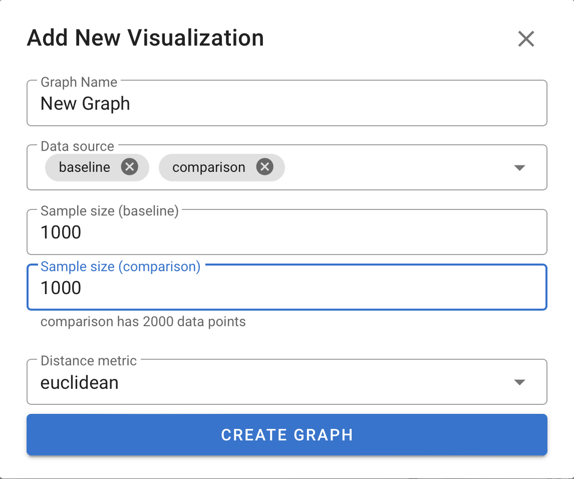
Visuals dropdown menu. A new graph can be created by clicking the
button to the left of this dropdown.
When creating a new graph, one or more of the subsets from the
DatasetSplit, or any number of saved groups may be chosen to
provide the source data using the Data source dropdown.
Additionally, a number of data points to subsample from each of these splits may
be specified; to keep the whole subset, specify a sample size larger than the
subset. If there is more than one embedding for the data, the embedding to use
to create the graph may be chosen here, as well as the distance metric to use to
measure similarity between embedding vectors.
Coloring the Landscape
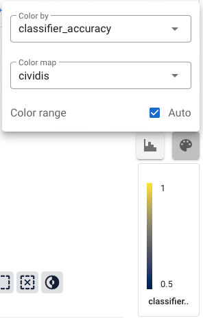
Every column in the dataset (as well as any column of a linked dataset) is available to color the nodes of the landscape. Since each node of the graph can correspond to more than one data point, there are a few subtleties that it’s helpful to be aware of.
The color for each node is determined by taking the value of the selected column for each data point in the node and applying an appropriate aggregation function to get a single value for that node. In general, this means that for a numeric column, we take the mean value on each node, and for a categorical column, we take the most common value for each node. Hovering the mouse over a node will show a label which includes this aggregated value for the node.
There are a number of different color maps available; choosing a categorical color map like tab10 will also use the categorical aggregation function. If there are more categories than colors in the color map, checking the Repeat colors box will reuse the same color for more than one category.
Autogroups
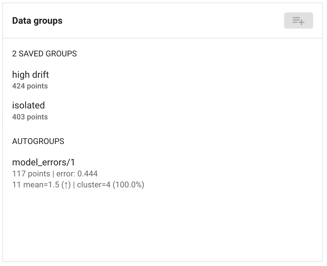
The UI will display all autogroups from runs with visible=True. These are
shown in a list to the right of the landscape. Clicking on a group will
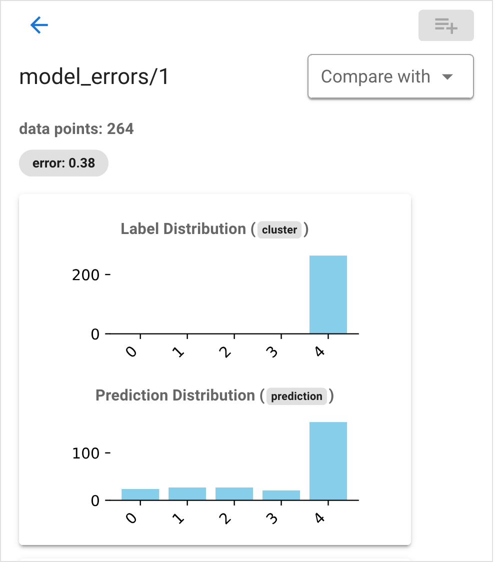
highlight the corresponding nodes in the graph and open a detail view.
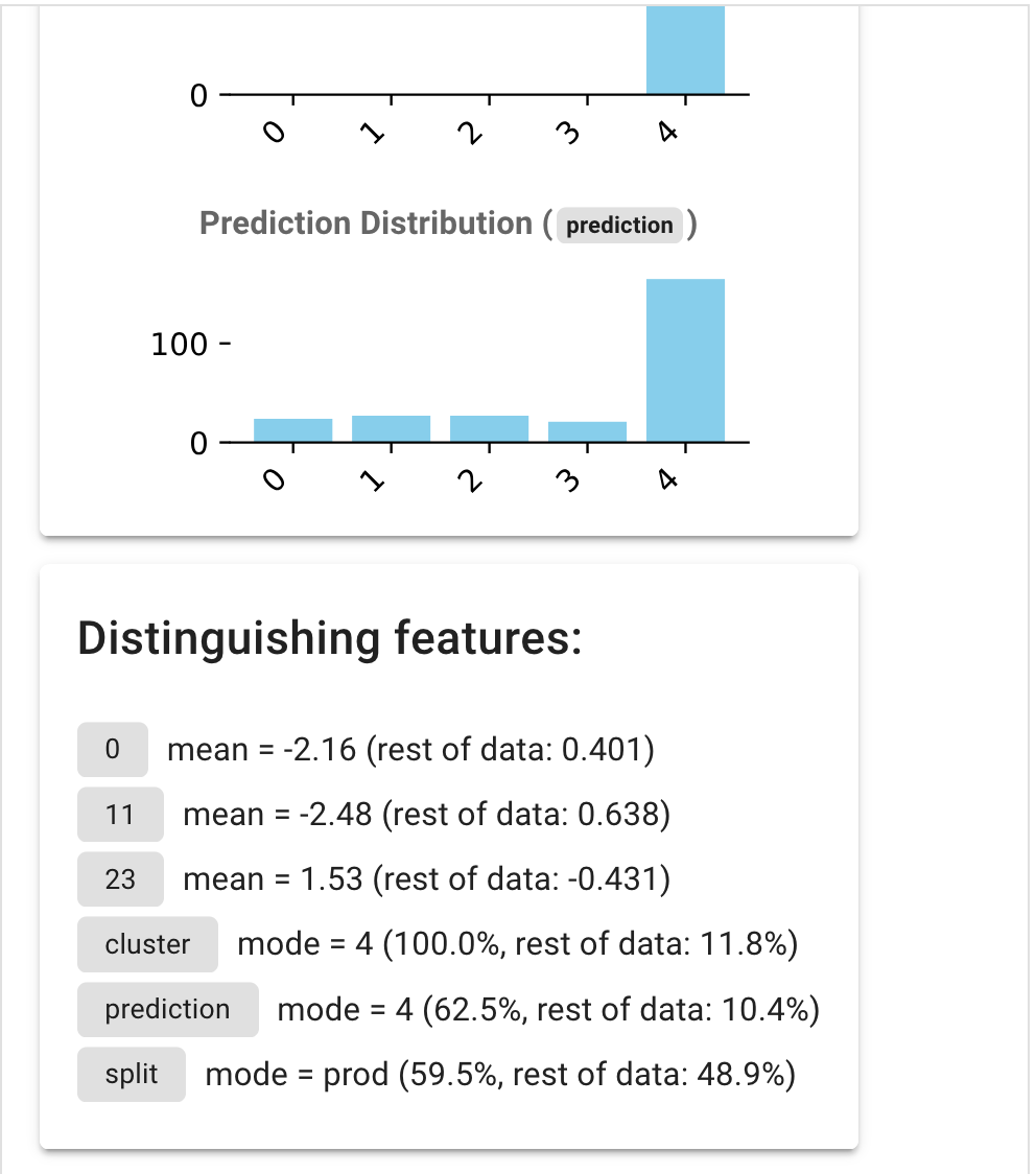
This shows the error rate for the group, as well as two histograms: one of the true labels and one of the model outputs. Beneath these is a short summary of features that are distinctive for the group:
These feature summaries come from three sources:
- Numerical statistical tests
These are summarized as
mean = 1.05 (rest of data: 0.23), giving the mean of the feature value on the subset compared with the mean on the rest of the datset.Up to three features of this kind are highlighted, based on the results of t-tests comparing the feature values between the group and the rest of the data.
- Categorical statistical tests
These are summarized as
mode = A (87%, rest of data: 30%), giving the most frequent value of the feature within the group, its frequency in the group (here 87%) and the frequency of that value in the rest of the dataset.Up to three features are chosen, based on the results of G-tests comparing the feature value distribution on the group and the rest of the dataset.
- Upper and lower bounds on the feature in the group
These are summarized as
>= 0, <= 1.2 (5% of data), giving the lower and upper bounds of the feature value, as well as the fraction of data points within the dataset that fall within this range.If the feature takes only a single value, it is summarized as
= 1 (2% of data).Up to three features are shown, based on how well the feature range describes the group.
Saved groups
You can also select groups of data points in the landscape and save them. To do
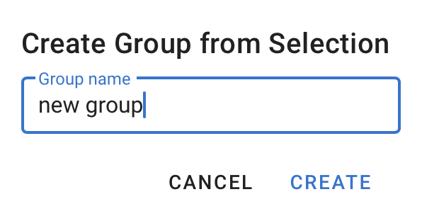
this, click the save group button  . This will open up a
dialog where you can name the group. Note that in order to create a group, you
will need to select nodes in the graph. If nodes are highlighted due to a
selected autogroup, the save group button will not be available.
If the Compute group stats option is checked, Cobalt will compute descriptive statistics comparing this group with the rest of the dataset, and these will be displayed when the group is selected in the UI.
Saved groups can be accessed using the get_groups()
method on the Workspace object, which returns a dictionary of
CobaltDataSubset objects.
Comparing groups
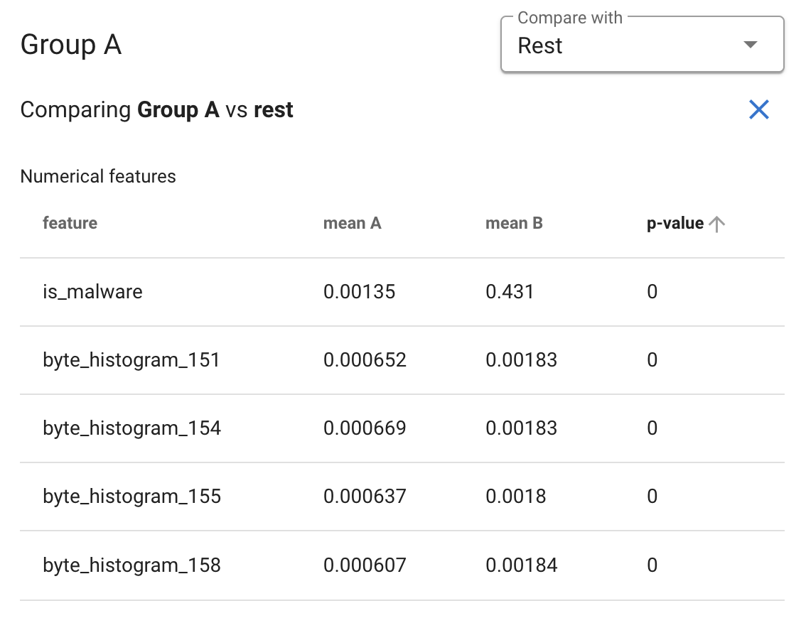
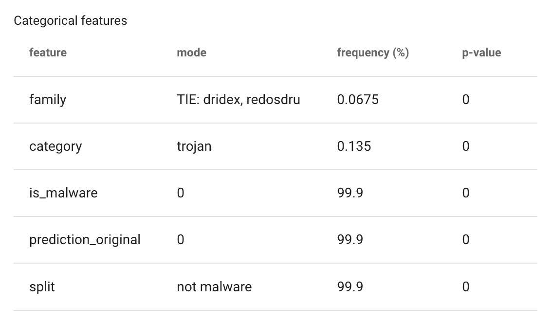
When you have selected a group from the list, you can also choose another group to compare it to using statistical tests. Choose the group you wish to compare to from the dropdown menu, and a pair of tables will appear.
The first table shows the results of a set of t-tests, comparing the two specified groups, one for each numeric column in the dataset. These are not corrected for multiple comparisons, and should only be used as guidance in selecting features for further analysis. The “mean A” column is the mean of the first group, and the “mean B” column is the mean of the second group.
The second table shows the results of a set of G-tests comparing the groups, one for each column in the dataset that is tagged as categorical or that has at most 10 unique values. Again, these are not corrected for multiple comparisons, and should be taken as indicators of potentially useful features to look at more closely. The “mode” and “frequency” columns describe the first group’s mode and its frequency.
Data Table
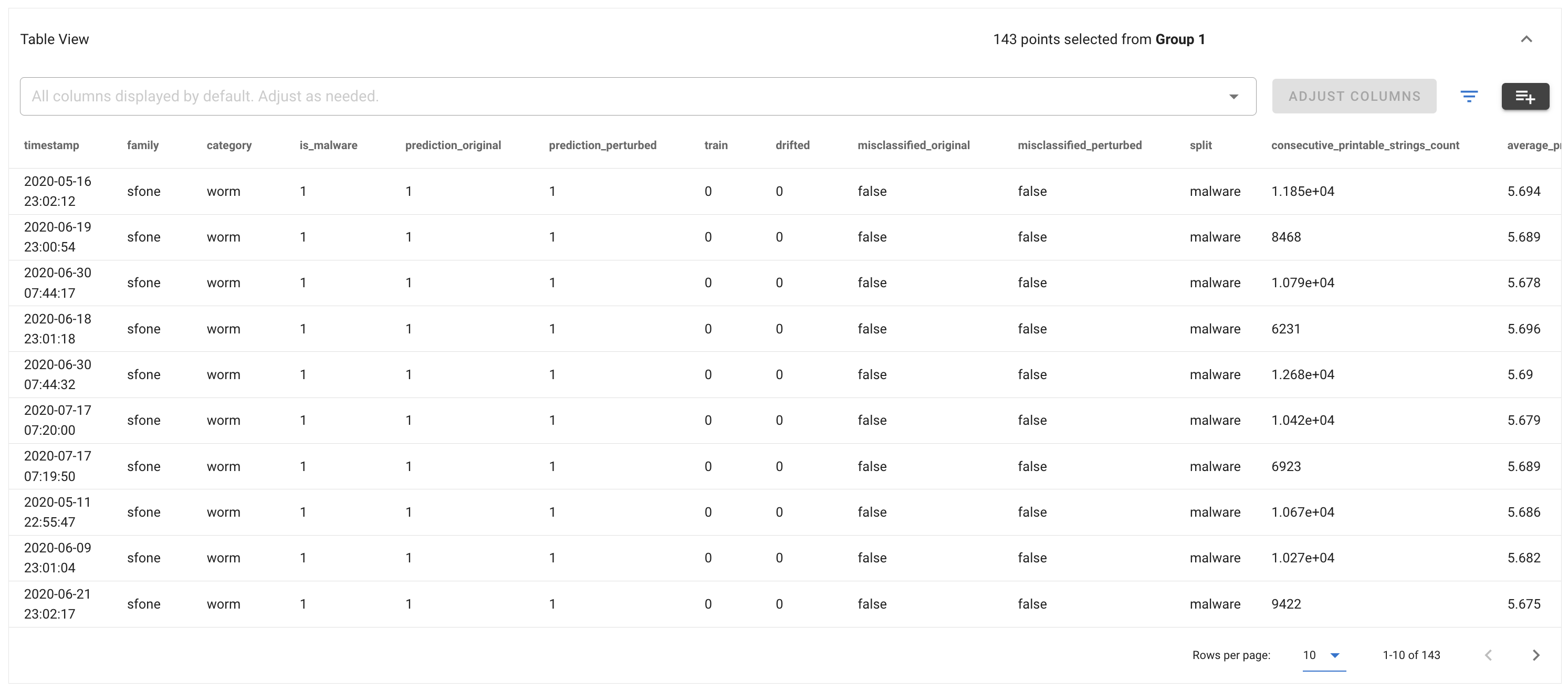
The data table shows the rows corresponding to the selected data points. The displayed columns can be changed by selecting the desired columns in the dropdown at the top.
Clicking the filter button  opens a panel to configure filters on the displayed data:
Select the desired options and click Apply Filter to add a filter. Filters will appear in a list and can be removed individually by clicking the “x” button or all at once by clicking Clear All.
You can create a group from the filter results by clicking the save group button
 in the table view.
